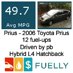
Thank you for making something like this! It's
much appreciated!
I don't think there's anything
wrong with this current size, but I do see everyone's point about smaller sizes being more beneficial for more people (for example, for use on blogs, or on forums where large signature images are too distracting). This image has a lot of whitespace.
Offering multiple sizes would cover a wider range of applications, and more people will benefit.

(and thus more people would hear about Fuelly)
I've made up a couple examples of smaller Fuelly banners that people might like:

100 x 17px

100 x 17px

145 x 20px

200 x 40px
And one that's not really suitable for a forum signature, but could work on a blog or something:

150 x 150px
I think I would be more personally inclined to use the 145x20 or the 200x40 ones.