A preview of our new site for Earth Day! - Fuelly Forums

Click here to see important news regarding the aCar App

Go Back   Fuelly Forums > Fuelly Community Support > Fuelly Web Support and Community News
Today's Posts Search Click Here to Login
Reply
 
Thread Tools Display Modes
 
Old 04-22-2011, 02:34 AM   #1
Senior Member
 
Join Date: Jul 2008
Posts: 260
Country: United States
Location: McMinnville, OR
A preview of our new site for Earth Day!

We've been working behind the scenes for the past couple months on a revamp of the entire site, and would like to show that off to existing members today.

This is very much a work-in-progress and we've got a lot of improvements coming down the road, but I wanted to show off the new design and a few new features before I describe what else is coming.

The beta site is at http://new.fuelly.com/.

Here's my car page as an example


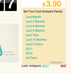
Aside from a new look, the car pages are a bit different, offering a new look, increased data in the graphs, and a way to filter your Cost Analysis section (click the little "2011" to get more options). When you filter the cost analysis, the setting "sticks" and is carried over to any other car you look at on the site, not just your own (so you can make comparisons)


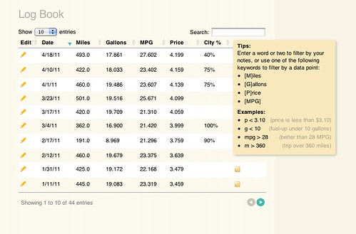
We'll be adding more stats (and custom options for whatever you want to track) but for now you can see expanded graphs and you really should check our the fuel log, which has some pretty fantastic search options.


The new Fuel up page offers the feature of telling us your City vs. Highway driving amounts, and yes, you can go back and edit your older fuel ups to include this information for an accurate reading on your car page (we are defaulting everyone to 50/50% for now, but will replace it with a "no data" static graphic by the time we launch the new design).
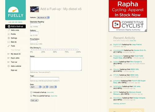


If you want to check out how the new design looks on other cars, hit the Recent Activity page and click on random users and cars to see their data.

The rest of the working pages on the site are just copies of the existing pages and features, but we will be slowly rolling out new versions of pretty much the entire site by the end of May. We've also just set unfinished pages as dead links for now, so not all parts of the site are going to work (you'll see the 404 page a lot if you click around).

Keep in mind this is the tip of the iceberg and we'll be debuting a lot of requested features in the next few weeks but I wanted to give a preview of what is to come.
__________________

mathowie is offline   Reply With Quote
Old 04-22-2011, 04:28 AM   #2
BDC
Registered Member
 
Join Date: Nov 2008
Posts: 274
Country: United States
Like Borat says, "Very nice!" These are changes that we've all been waiting for.

Couple of questions:

1) Will the "recent fuel ups" line graph show more than 10 fuel-ups (for example, as many entries as we opt to show in our log book)?

2) Will the bar graph for average mileage by month have a constant zero for the y-min value (like it always has), or will it be scaled to the minimum mileage point like the new site does? The scaling makes the graph deceptive (for example, for our Scion, from sept. to oct. 2010, it makes a 3mpg/10% drop in mileage look like a 50% drop-off).

3) This might be going out of the scope of the changes, but would there be a way to make the "cost analysis" time period show more than just cost statistics? For example, if I wanted to find out how many miles I had driven or what my MPG was in the past 3 months in addition to how much I had spent.

4) Thanks for spending your time making the site work better!
__________________

BDC is offline   Reply With Quote
Old 04-22-2011, 05:51 AM   #3
Senior Member
 
Join Date: Jul 2008
Posts: 260
Country: United States
Location: McMinnville, OR
Hey BDC, we are testing this new layout and feature set, and one of the things that has come up is that maybe the cost analysis filter could instead be a filter for all data shown on the page. So it defaults to just this year, or the last x months, but if you changed it to say, 2009 or All Time, not just your cost analysis would change, but the graphs, the # of fuel ups and miles, and log entries below.

If we did that, that'd solve pretty much all your questions, correct?
mathowie is offline   Reply With Quote
Old 04-22-2011, 06:55 AM   #4
BDC
Registered Member
 
Join Date: Nov 2008
Posts: 274
Country: United States
Pretty much, except for the vertical scaling on the monthly averages. It is much more useful when the lower limit is zero and only the upper limit is scaled.
BDC is offline   Reply With Quote
Old 04-22-2011, 08:52 AM   #5
Registered Member
 
Join Date: Sep 2008
Posts: 123
Country: United States
Location: Orange County, California
The new site looks fabulous, thank you Fuelly for all that you do, I truly appreciate it. I love the current site, but it looks like I might be in for a very pleasant upgrade when the new site is ready.

Will all of our old data from the original site be automatically uploaded to the new site or will I need to reenter my historical data?
bates is offline   Reply With Quote
Old 04-22-2011, 08:59 AM   #6
Junior Member
 
Join Date: Aug 2008
Posts: 1
Country: United States
The input page on the mobile version expanded vertically a few months ago, requiring more scrolling. Seems like it could be compressed back down so I can see more input boxes at once.
andrewgd is offline   Reply With Quote
Old 04-22-2011, 09:01 AM   #7
pb
Senior Member
 
Join Date: Jul 2008
Posts: 1,588
Country: United States
Location: Corvallis, OR
You won't need to do anything on your end bates. All of your data will be the same when we launch the new design—you'll just have some new ways to look at it.
pb is offline   Reply With Quote
Old 04-22-2011, 09:07 AM   #8
pb
Senior Member
 
Join Date: Jul 2008
Posts: 1,588
Country: United States
Location: Corvallis, OR
Sorry you don't like the recent changes to Fuelly Mobile, andrewgd. The fields are a bit farther apart to make them bigger targets for people's fingers on smaller screens. If you have big fingers you might appreciate the change, but if you don't it might seem like a waste of space. Thanks for the feedback.
pb is offline   Reply With Quote
Old 04-22-2011, 10:32 AM   #9
Senior Member
 
Join Date: Oct 2009
Posts: 216
Country: United States
Location: EUP Michigan
One thing that stands out immediately to me is the page sizing. My netbook will not show it correctly, due to its screen size I'm guessing... (1024x600)

Current site, no problem, new site, sticks off the edge now. lol

Outside of that, looks really good guys, nice work!
DTMAce is offline   Reply With Quote
Old 04-22-2011, 07:45 PM   #10
Member
 
Join Date: Jun 2009
Posts: 69
Country: United Kingdom
Location: Windsor
I found an issue, I adjusted the highway / city ratio and found afterwards that the cost per litre and amount used bore no relationship to their previous values, there was an obvious impact on my stats (I've set them back)
__________________

udtrev is offline   Reply With Quote
Reply


Posting Rules
You may not post new threads
You may not post replies
You may not post attachments
You may not edit your posts

BB code is On
Smilies are On
[IMG] code is On
HTML code is Off
Trackbacks are Off
Pingbacks are Off
Refbacks are Off


» Fuelly iOS Apps
» Fuelly Android Apps
No Threads to Display.
Powered by vBadvanced CMPS v3.2.3


All times are GMT -8. The time now is 01:16 PM.


Powered by vBulletin® Version 3.8.8 Beta 1
Copyright ©2000 - 2024, vBulletin Solutions, Inc.